Choosing charts that finance actually uses for budget variance
Waterfalls, heat maps, and simple bars each answer different questions. Matching the chart to the decision keeps variance packs readable.
Waterfalls, heat maps, and simple bars each answer different questions. Matching the chart to the decision keeps variance packs readable.
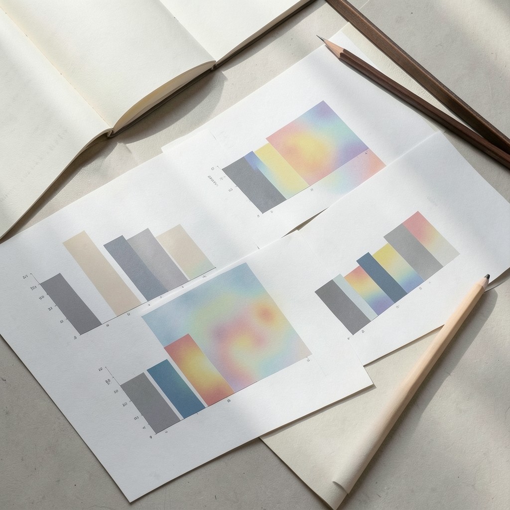
A budget variance dashboard fails when every measure fights for the same visual treatment. Finance readers scan for material movement first, then for cause, then for trend. Chart choice should follow that order.
Use a waterfall when you need to walk from plan to actual across a handful of drivers — volume, price, mix, timing. Keep the bars few; a waterfall with a dozen tiny steps forces the eye to hunt.
Use a ranked bar or table with conditional marks when the question is which cost centres breached threshold. Heat maps help when many centres and periods must be scanned together, but they need a clear legend and a limited colour scale.
Line charts suit forecast-to-actual tracking across months. Avoid stacking too many series; five lines is already crowded for a projected screen in a meeting room.
Whatever you choose, label the variance direction in words as well as colour. Colour-blind readers and printed packs still appear in Thai finance meetings, and a green-red only cue is not enough.